Flawed by Design: The Eroded Perfection of Tabor Robak's Broken Printer

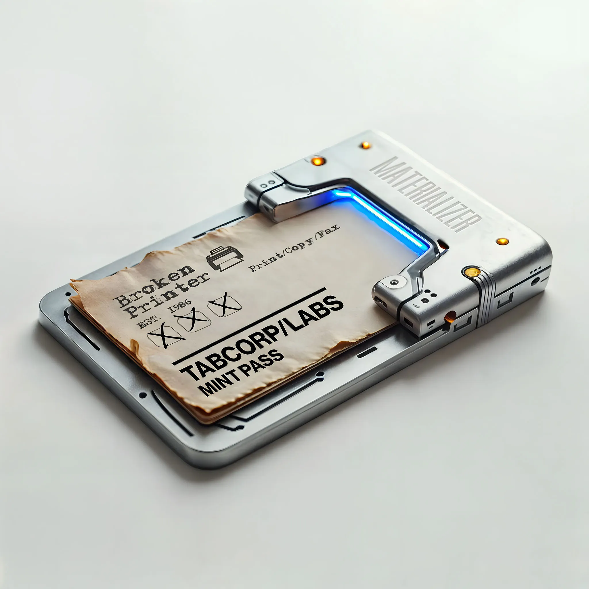
The process of modern printing exists between two worlds. It is instinctively an analogue one, but in reality, lives increasingly in the digital sphere. The resulting tangibility is often referenced when pitting the benefits of physical against digital media, but its real secret sauce lies in its unpredictability, its errors, its randomness. Its propensity to ‘break.’
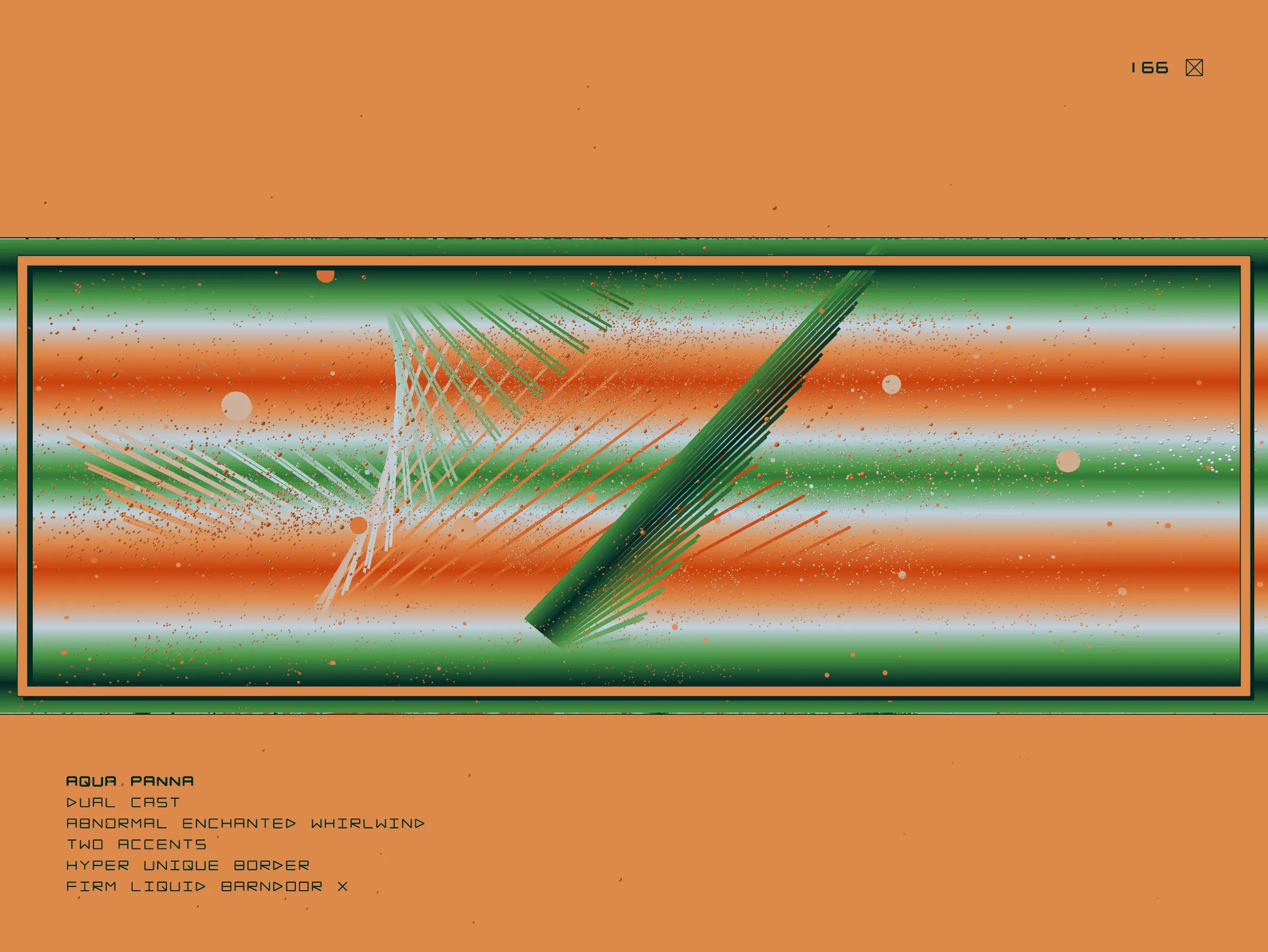
Like much of Robak’s practice, Broken Printer explores what he describes as, ‘the realm of commercial creativity, things that are typically not thought of as being part of the art world.’ By repurposing mundane commercial elements like test sheet imagery and Microsoft clip art, he constructs intricate digital works whose core components, once symbols of functional, utilitarian design, are subverted and transformed through generative layers of abstract stratification, paint splatters, and ink smudges. This process highlights the tension between the intended perfection of the commercial graphics and their inevitable defacement and erosion. The juxtaposition between the ideal and the reality. As Robak describes himself, ‘The world of perfection is suddenly smudged; it’s made more human, it’s made interesting.’

These ideas and stylistic choices have a strong history in design, perhaps most notably in the ‘Grunge aesthetic’ of the 1990s. Pioneered by designers like David Carson and Chris Ashworth, this movement revolutionised graphic design with chaotic layouts, distressed typography, and the deliberate embrace of imperfections. The influence of this raw, unpolished style, which broke away from conventional design norms, can be seen clearly in Robak's approach. Just as Carson and Ashworth used Grunge to challenge and redefine visual communication in print media, Robak leverages these principles within a digital context, transforming commercial imagery into intricate, layered compositions that challenge the traditional idea of ordered digital perfection and highlight the beauty in random flaws and errors.
“Beauty is essential in my artwork, and beauty can be imperfect. Beauty is a sense of freedom.”

By translating the tropes and errors of physical print into the digital medium, Robak plays with a form of aesthetic skeuomorphism, building a bridge between the two, preserving the language of the printing process while also recontextualising it for the digital age. By doing so, he offers a poignant commentary on the nature of cultural consumption today, both in its altered media and its flattened context. What reference point does someone who views media through a screen have for printed errors, registration marks, or even the degradation of a physical product? As digital consumption continues to overtake that of traditional media, these tropes become further unanchored from their original frame, developing new stylistic etymologies, and adding shifting meanings to existing works.
Although the series closed in April, minting out at 2290 works across 15 'archetypes', a 16th archetype is still being slowly added to the collection. The Gutenbergs exist as an outlier within the language of Robak’s Broken Printer. Inspired by the woodblock processes of their 15th Century namesake, oddly, they alone in the series offer a crisp, clean, monotone, ordered image, feeling somewhat removed from the maximalist expression on display throughout the rest of the series.

In a wonderfully playful process of collection and creation, one must acquire each of the 14 named archetypes as well as a hidden 15th before a single Gutenberg can be created. This collector curation, combined with Robak’s studio practice give the Gutenbergs an almost collaborative potential, while the small numbers of certain archetypes available needed to call one into being, means that by design, they are highly limited, echoing the artisanal processes and outputs of the original press.
The Gutenbergs are not just a rare opportunity to collect a unique work hand crafted by Robak, but show a digitally native artist diving head first into the possibilities of web3’s creative potential, embracing its mint mechanics, traits and social aspects to create a work that speaks to the space that birthed it as much as it does Robak’s love of the physical process that inspired it.
In essence Robak’s Broken Printer, much like its output, is multi-layered. It stands as a testament to the convergence of past and present media and is rooted in a deep understanding of the fallibility and generative potential of both. It is an archive, both preserving the quirks and flaws of a process that Robak loves and aligning them with his own generative practice. Most pertinently perhaps, it’s an exploration of the transitional time we exist in; neither wholly analogue nor wholly digital. Through the exploration and fusing of media styles, imbuing the work itself with this same transitory language, Robak creates a series that is at once aesthetically digital, and analogue, contemporary, and nostalgic, speaking towards the future using a language that increasingly feels of the past.
Written by @abrokenaesthetic
Tabor Robak
Tabor Robak is an American digital artist, renowned in the field of new media, currently based in Paris. He began his digital art career at age 13 as a Photoshop editor and later obtained a Bachelor of Fine Arts from the Pacific Northwest College of Art. Robak's career progressed in New York City, where he participated in group shows at MoMA PS1 and the Lyon Biennale, leading to his first solo...
Subscribe to get the latest on
artists, exhibitions and more.


