verse
INTERVIEW

Weaving the Digital: A Celebration of Unicode, Textiles, and Computing

Journal article cover

When did you first learn about textiles, and when did it become apparent to you that it was a direction you’d like to explore as a digital artist?

When starting out on my path as an artist I was drawn to the work of a number of women artists working with textiles at the Bauhaus - particularly the work of Gunta Stölzl, Otti Berger and Anni Albers. This interest led me to take a decisive turn in my career and to pursue Textile Design as my first degree rather than art - which is what I originally intended to study - but it was decades years later before I returned to textiles in my digital work. 

As a writer, I was thinking about ways in which I could combine writing and visual art for some time and while I was very much interested in the metaphorical link between writing and textiles, I was also interested in the historical link between textiles and computing, and their shared history of punched-card programming. So many different threads were coming together into a single realm - text, textiles, early computing and programming and importantly the digital expression of all those things interwoven. Generative strategies seemed to be the perfect way to explore these ideas in a single environment.

Preparatory drawings for tapestries by Anni Albers, 1926 and 1927.

Would you say this series was inspired by historical punch-card program aesthetics?

I'm not entirely sure if there is a 'punched-card aesthetic' but there are, of course, aesthetics directly tied to technologies (and the constraints those technologies provoke), and also programming languages (and the processes they invoke). It seems to me that something of the jacquard loom aesthetic of weaving survived into the era of early programmable computers and this is especially true for computer printer technologies such as teletype. 

What really drew me to teletype were the fixed-width dot matrix characters that could be used to create patterns constrained in rows and columns. The textural quality of these characters when arranged in patterns also reminded me of jacquard loom weaves which are in themselves a kind of proto-pixelism. So it is interesting that there is both a technological lineage passed from weaving to computing and an aesthetic lineage that was passed through too. For example, looking at the outputs of ISO IEC 10646 it is easy to trace a path back to the aesthetics of teletype printouts at a time when computers were still programmed by punched-paper card, itself a legacy from programmable looms.

Paul Prudence, Stela XIV (Parity), 2023.

Could you speak a bit further on Unicode character, what they are/when they were introduced to the world.

Unicode is a text encoding standard maintained by the Unicode Consortium designed to support the use of text in all of the world's writing systems used on digital computers. Its repertoire includes common characters such as letters and numerals, as well as punctuation and other more esoteric symbols. At the most abstract level, Unicode assigns a unique number, called a code point, to each character. So every character used on a computer, no matter what the platform, what the programme, or what the language, has the same unique id. Unicode was developed to transcend the limitations of the many different text encodings that were used until to the point of its inception in the 1980s when a group of individuals from Xerox and Apple first began to investigate the idea of creating a universal system. Since then - and on a regular basis - the Unicode Consortium - a group of computer professionals, with some linguists and scholars - meets to coordinate Unicode's development.

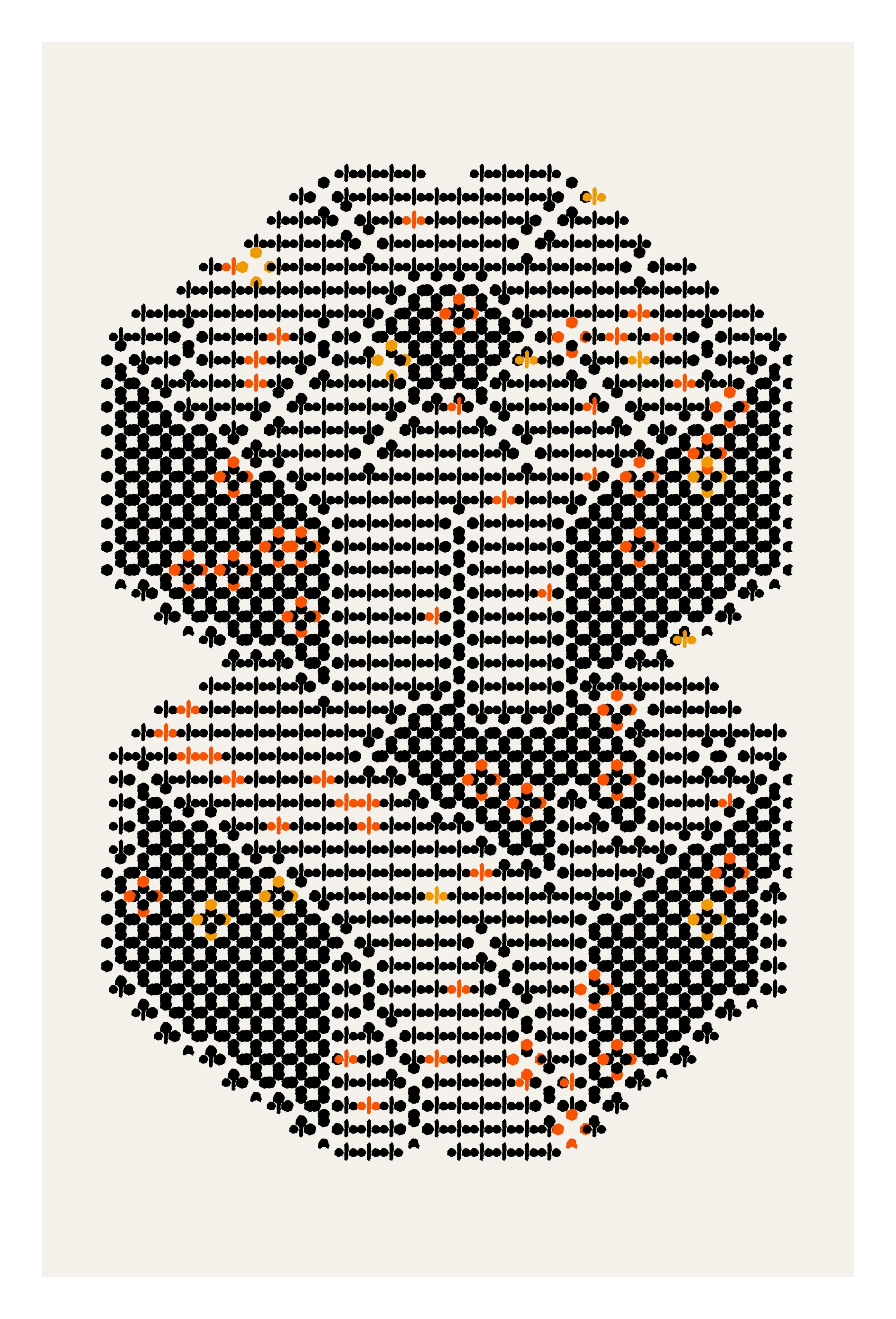
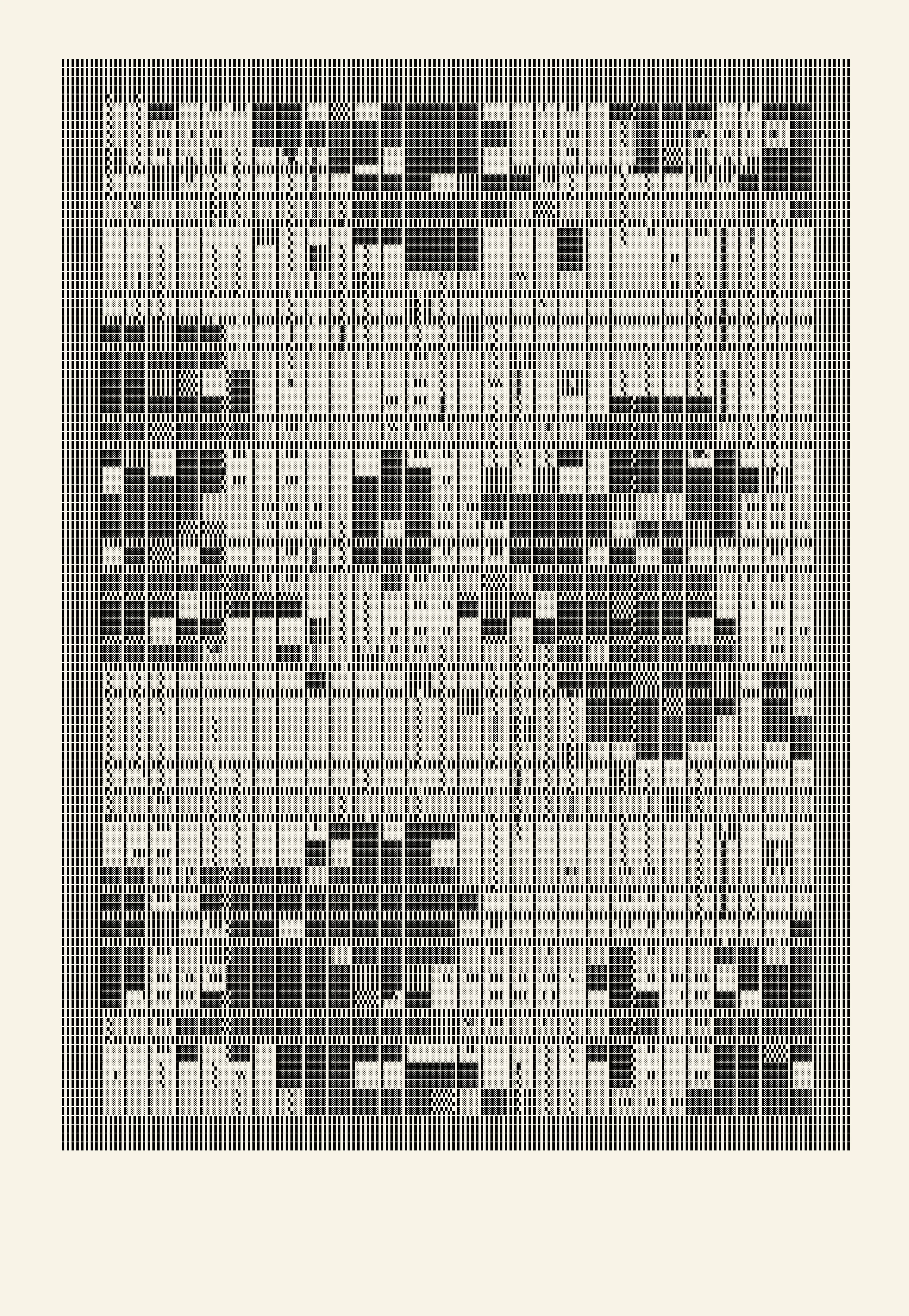
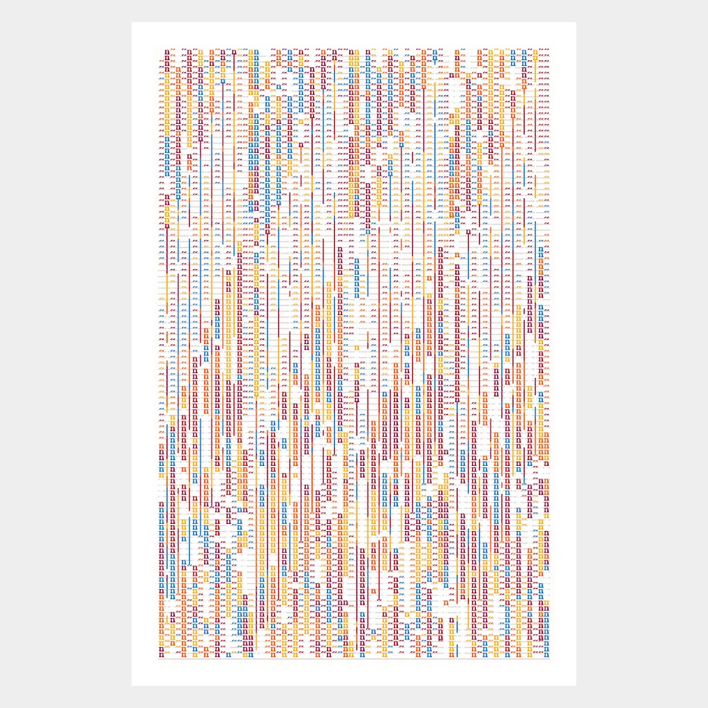
A very small and interesting subset of the Unicode characters set are the so-called Block Elements. These are square block symbols of different shapes with various fill and shading treatments. They were originally added to Unicode for use in software terminal emulation, but over time they have become used for box-drawing, shading and for filling regions of the screen. Since their original utility has shifted with time, I find it interesting that they have become the index fossils from an era of ancient computing. Perhaps more importantly as a textile designer it appears to me that each character also resembles a single unit of a weave pattern, so that when these characters are combined over large areas they create the impression of recognisable weave patterns. When different characters are combined in small groups they look a lot like textile swatches. Because some of the characters are shaded with dots, in different densities, they further reference the warp and weft of a fabric interwoven.

It's probably worth noting here that the title of the series, ISO/IEC 10646, is the international standard reference that specifies the Universal Coded Character Set.

Despite the flatness of the screen, you’ve created depth and texture in each composition, was a focus of yours to highlight the nature of physicality behind digital-work in an attempt to bridge the gap between physical and strictly digital art?

Yes, exactly that. In my early experiments I found that specific combinations of characters created a textural depth in some of the outputs. Sometimes a strong optical effect led to the impression of one thread or set of threads overlaying or interlocking with another. At other times very flat areas seemed to be counterpointed with raised effects like flocked fabrics. Sometimes 'holes' appear in the outputs as if the 'fabric' had been distressed or worn, and sometimes the patterns appear like Devoré prints where a fabric is printed with an acidic solution that dissolves certain fibres to create a semi-transparent pattern against more solidly woven fabric. This kind of fabric resembles lace.

What is the significance behind the slightly off-white colored digital canvases, and the centralized compositions with space at the margins?

The off-white colour references old computer printouts and teletype paper. As a child I grew up in the era of printer paper that used sprockets and dot matrix characters. My earliest computer science lessons involved using a machine with a dial-up modem. I used to spend my lunch breaks writing programs in BASIC using trigonometry functions to plot visual patterns which I would then print out on a dot-matrix printer. As I developed the series it became evident I was interested in evoking a specific era of computing as well as referencing the relationship between textiles and computing. I found this off-white, aged-printer paper colour very conducive to the nostalgic effect I was trying to achieve.

The way the composition is framed on the 'page' with space references traditional framing techniques where you use a paper mount. Given that I was interested in quoting these earlier technologies, it felt as though these compositions would benefit from that space. It also gives a composition an area in which to breath, especially if the output has a lot of information encoded within it, as the series does.

Space Invaders, 1970s.

How did you land upon the specific aspect ratio for the entire series?

I've always felt instinctually comfortable with that aspect. It just feels right without any technical justification, at least for me.

Did video-game aesthetics play into this series? While the series is mostly abstract and almost leaning into an op-art aesthetic, a few seem figurative at times and reminiscent of video-game landscapes.

There certainly are video game-like landscapes contained in some of the outputs. Initially these were arrived at mostly by chance but once I saw them emerge I saw yet another convergence and I began to try to find ways of generating similar ones. It seemed to me that the pixillated blocks began to mimic early computer games such as Space Invaders, Pong or certain arcade platform games. More so, the distressed pixel effect insinuated partly destroyed structures, spaceships, rockets and other debris. Some of the outputs began to suggest the idea of bit-rotted rugs containing scenes from shoot 'em up arcade video games. 

It also created a folkloric aspect to the series by reiterating a cultural trend of certain societies to commemorate scenes from their histories in the artefacts they made. Just as there are old tapestries that depict scenes from culturally significant effects, my 'pixel rugs' began to depict frames from the earliest computer games. Coincidently some of these games I am referencing were released in the late 70's when teletype and dot matrix printing was still in full swing. So many things were coming together, colliding, and focusing on a common era.

Paul Prudence, ISO/IEC 10646, 2024 (close up).

When zooming in to the pixel-layer of the piece, there are grey outlines alongside the black characters, why is this?

Those are artefacts caused by combinations of different characters with different leading and kerning on the font which can sometime cause overlaps subsequently leading to interesting lines and patterns caused by those overlays.

The grey undertones are generated by using specific block element characters such as 'U+2591 ░' and 'U+2592 ▒' These characters echo the patterns from half-tone printing where the image is broken into a series of dots to reproduce the full tonal range of a photograph or to create gradients. These shaded characters work particularly well as a background warp on which to weave darker solid patterns with 'U+2588 █' and another favourite character 'U+259E ▞' - which I use a lot. Different combinations of characters generate this feeling of depth and texture, in not always easily to predict ways.

Could you speak a bit about the constraint of grids, and the choice of utilize them to create complex compositions? Is it in a sense a homage to the process of early digital-art making?

Yes, all these things and more. I am very much interested in the universality of grid-based systems for mapping, planning, encoding and as a basis for notational systems. Forms of representation using grids often mimic one another and this is why, for example, a photograph of a computer chip may closely resemble the plan of a city. It will also help to explain why a knitting pattern might also echo a notational system in music or mimic a frame from a Cellular Automata program. From a 'pattern recognition' point of view, I am interested in how our perception - hardwired to the database of personal memories - triggers the illusion of these visual representations across different visual domains. Aside references to 8-bit computer games I also reference rubrics from simple boardgames and puzzles, as well as the aesthetics of MS DOS's Defrag program and sequencing systems of ciphers and codes.

Paul Prudence, Two Scores (Song to Nothing), 2023.

Could you speak a bit about how this series ties to the evolution of your artistic practice and what moment it marks in your trajectory in regard to your past and looking towards your future?

This series marks a full culmination of a few years of work exploring the use of text and signs as a material from which to weave fabrics of encoded patterns. The works in the ISO IEC 10646 collection also mirror processes and ideas I've been experimenting with on mechanical typewriters, where I use a process I call 'automatic pattern writing' to build structures from text and free it from semantic meaning. So this series brings together many conceptual and aesthetic ideas into one place, and as such it become a progress report on the current state of my practice. I also believe that this series is a signpost to further developments in the same area of textual experimentation, with the possibility of animation and physical pieces exploring the same theme.

What year would you say you started creating digital art/code-based art?

I'd say tentatively that the year I began creating digital art was around 1998 when I began to publish simple code-based art using Flash and Director online. I say tentatively because it wasn't until 2006 that my work was included in exhibitions and then that I began to seriously consider myself as a generative artist. It was also around this time that I began to experiment with much more powerful software such as VVVV.

New York Times, 1965.

If you could say anything to a pixel, what would you say?

Do you remember your earliest recollection when you first came into being in 1965 and your name was published in a paper for the first time to describe scanned images of the Moon and Mars? Do you remember your ancestors before that time? What can you tell us about them? 

Is this series inspired by concrete poetry, and is there a hidden meaning within the characters placed on each digital canvas?

I've been inspired and informed by the concrete poetry movement for a number of years and I have been interested in the use of text as a material from which to create encoded abstractions but with visible clues and references. In concrete poetry, intent is conveyed by the graphical organisation of letters and words rather than by the meaning of words in the conventional sense or by combinations of word-play and graphic construction. 

All the works in this series use a specific range of Unicode characters that were originally devised to be used to emulate a video terminal within a specific display architecture. The block element characters would have been used in applications such as command-line interfaces and so they would have had their own system-dependent semantic meanings. So I am really reusing these characters and repurposing their original semantic utility for my own use. I do, however, find it interesting that as signs they also approximate other semiotic systems or, for example, suggest graphical elements of arcade games. So a single block element can have multiple meanings at the same time, and be transcoded from one meaning to another depending on the way it is used, and the context in which it is displayed. This is very interesting to me because it links back to the idea of universality in languages and systems of writing.

Paul Prudence, ISO/IEC 10646, 2024.

When curating the series, what did you want the final outputs to exude?

Difference, similarity, and also repetition are all important considerations, but also a sense of coherency among the different pieces. It is important to me that each piece should stand well on its own while still existing as part of a group, reflecting and mirroring the qualities of other pieces in that collection. Collectively the pieces chosen for the final selection should – when viewed together – solve the puzzle of how the pieces were constructed, and the intent behind them, without any explicit description.

It is interesting that the role of the generative artist becomes paradoxical at a certain point because first they experiment with an expansive range of possibilities and then as they refine the work towards its final published form they must become reductive and choose a few from the many to fit the aesthetic remit of the main concept. At a certain point the artist moves from open experimentation to rigorous self-curation. The challenge is to curate a wide range of surprising outputs that are interesting to the artist and collectors alike by a process of aesthetic natural selection.

Paul Prudence

Paul Prudence is a writer and artist. His essays have been featured in Reliquiae, Substance and Holo, he is also regular contributor to Neural Mag. His audio-visual work has been exhibited and performed internationally at intermedia arts festivals.

View profile

Ivan Zhyzhkevych

As a long-time collector with an unparalleled passion for digital art, Ivan curates from the heart.

View profile

Subscribe to get the latest on 
artists, exhibitions and more.