Subscribe to get the latest on
artists, exhibitions and more.
Fragmented Texts: Exploring the Fluidity of Language with Mark Webster

A written language is a complex tissage of signs and symbols. A conventional system of coherent patterns with which one seeks to express meaningful actions, ideas, thoughts and feelings. What happens though when one loses the capacity to decipher these visual constructs?
An interview with Mark Webster, conducted by curator Ivan Zhyzhkevych.
IZ: What were your initial sources of inspiration for this series?
MW: One day I came across a small publication by the late poet, Bob Cobbing, entitled Type Cast. It’s a small collection of facsimile documents that present distorted letters. That work struck a chord with me.

IZ: Why did you put each piece within a “frame”, rather than the composition overtaking the entire digital-canvas?
MW: This is something I’ve done with many of my digital works and the reason is simply because it helps in the perception of the image. I can alternate between a black and white background and that slight margin of space can help emphasise visual elements, especially when the image is monochromatic. It also lets the visual field breath a little and of course helps in setting an image apart when placed on a different coloured background.
IZ: Do the color palette’s within the series represent a particular feeling or emotion?
MW: There is no explicit intention on my part to use colour as a means to elicit emotion. Personally, I think that this can be a trap – associating emotion with colour – because colour is heavily symbolic and culturally orientated. Like emotion, there are no universal colours in my opinion.
Beyond the physical phenomena of the colour spectrum that we can all observe and label, we all perceive colours very differently. So, the palette is restricted to a small selection that was chosen more for their contrasting qualities. I wanted some variation, not just all black and white and I also wanted to intensify visual details. Colour is therefore used here more as a visual device rather than some attempt to communicate anything in particular.

IZ: Each composition is highly varied, could you speak on how this relates to language and it’s fluidity?
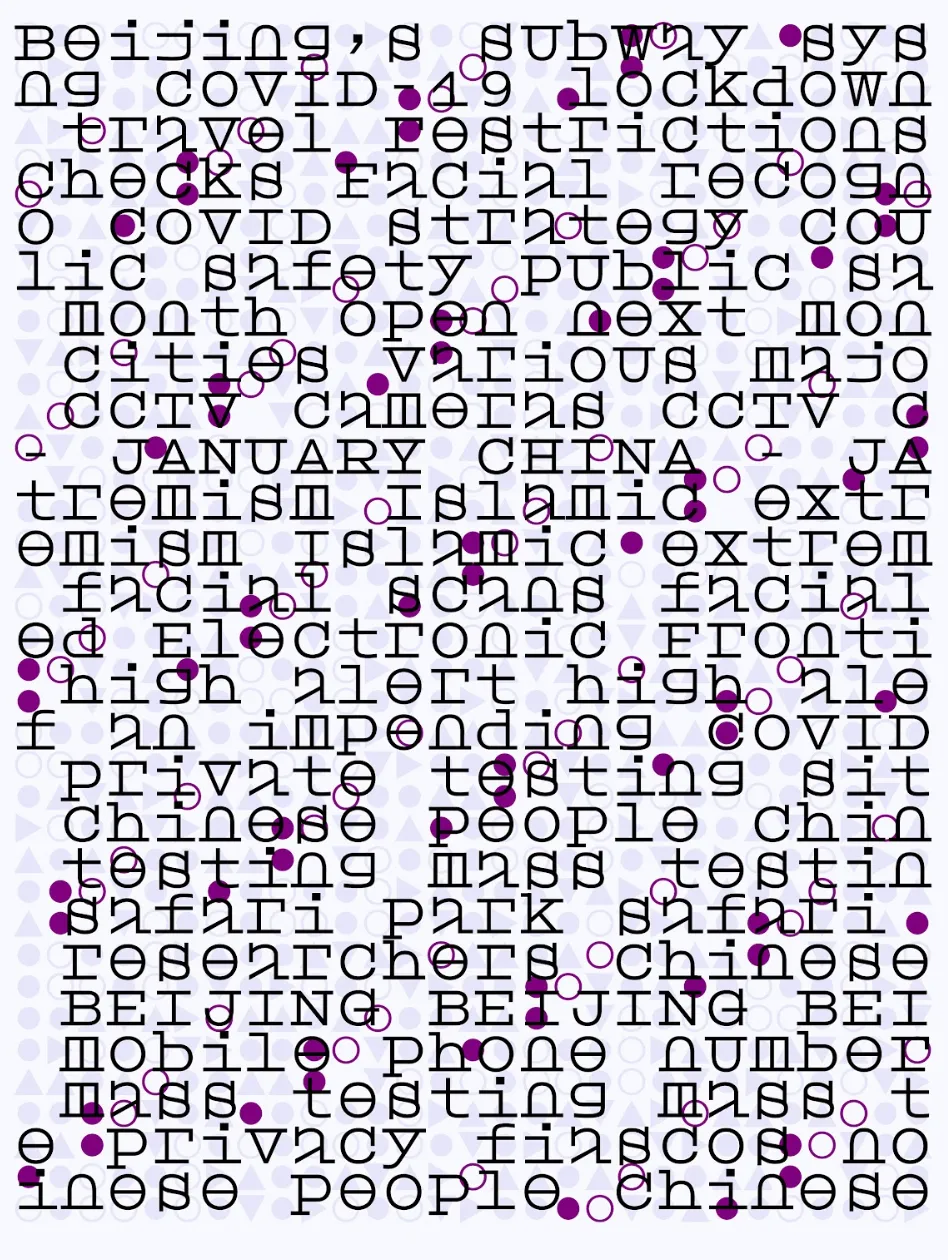
MW: These pieces came about at a time when I was personally struggling with text. It should be noted that the work is a reflection on language as text. It’s important to make that distinction, that the work is about the purely visual aspects of what we perceive as text. Text is by nature linear but our experience of it, especially on the page, is far from that. We all read in different ways and for different reasons. I wanted to express something highly personal – the fragile and fragmentary nature of text. How my experience of text was loosing this linear structure and becoming something else. So, I hope that we can recognise text in the work.
There are iterations where letters and text are more apparent while some have utterly disintegrated, becoming an abstract image of pure form. Perhaps these more radical compositions reflect the more imaginary state of memory. Which is odd really, because we don’t remember texts as images per se, we remember concepts and eventually associate other images with these. So I guess I’ve been spending too much time with text. I don’t know.
IZ: Can you speak about your experience of collaborating with technology as your journey dives into custom-made software and generative processes?
MW: It’s a vast open scape of possibilities out there!
IZ: Which works in this series did you develop a specific font for, and what does the inclusion of it mean for the series as a whole?
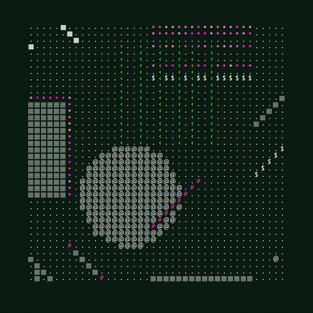
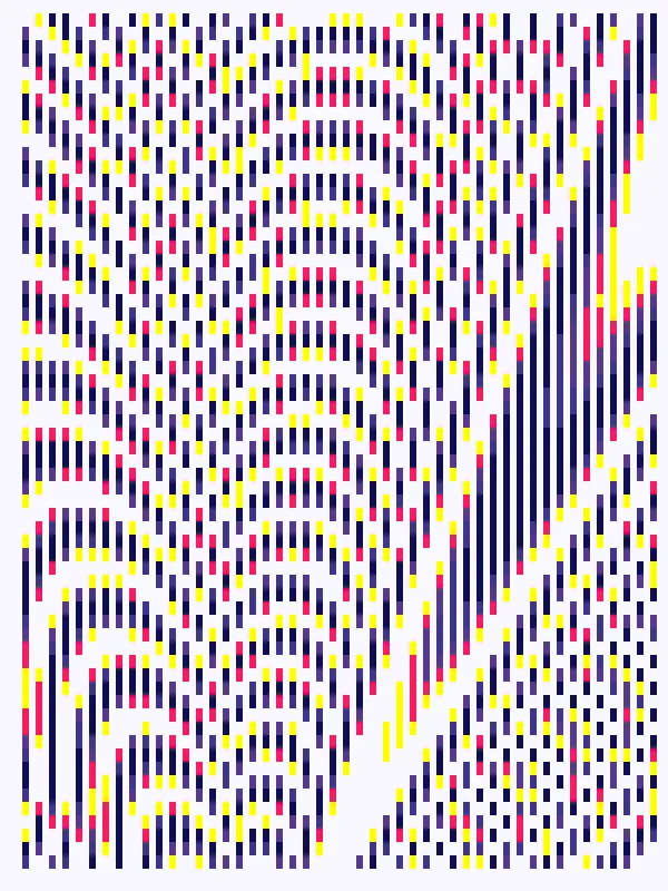
MW: Almost all used a particular bitmap font that I had made some time ago now as part of a research project. It’s a very simple font made from the basic pixel unit and within a limited grid, so due to this binary nature it really lends itself well to the overall treatment I used throughout the series. If you zoom into each image, you’ll realise that everything is composed of perfectly square pixels. Beyond the purely visual aspects of this treatment, there could be a lot to say about the relationships between text, textiles and indeed computers.
On a more general note, I work a lot with written language and hence fonts. I’m fascinated by this idea of how letters are formed and that through particular disciplines such as typography and type design, our languages are given visual form and consequently shape our experiences of text.

IZ: Which textual elements in specific were the starting point of the series?
MW: I alternated between the simple units of single letters to whole texts.
IZ: Certain iterations veer into pure abstraction, absolute loss of letter-form: could you speak about this direction of the series and if it relates to notes of dementia and other memory-loss illnesses?
MW: Indeed, I wanted the work to be quite radical in nature and reflect my own personal impressions of text. By convention, text is highly organised and linear in nature but this is in stark contrast to how we might actually see, read, remember and eventually recall text.
Human memory is a complex mechanism and my rather simple understanding of it is that it requires focus and attention. Those vital resources are something that I felt I was increasingly struggling with and, without going into any boring details, it was hugely affecting something that is dear to me - reading. I guess that is where the series title, ‘distraKted’ comes from. Distractions were not just an activity taking me away from something I should be doing, they were constant, rapid and forever changing. At times, within a split second. I couldn’t get past the first line of a text sometimes without my mind wandering. So, it was like a noisy parlement of conflicting thoughts and ideas occurring all the time I wanted to read. Text became heavily fragmented, splintered, brittle, extremely fragile, volatile and yes, binary. These were the adjectives I was seeking to express with the work.
IZ: Is there a specific iteration you’d feel is the “face” of the series, and why?
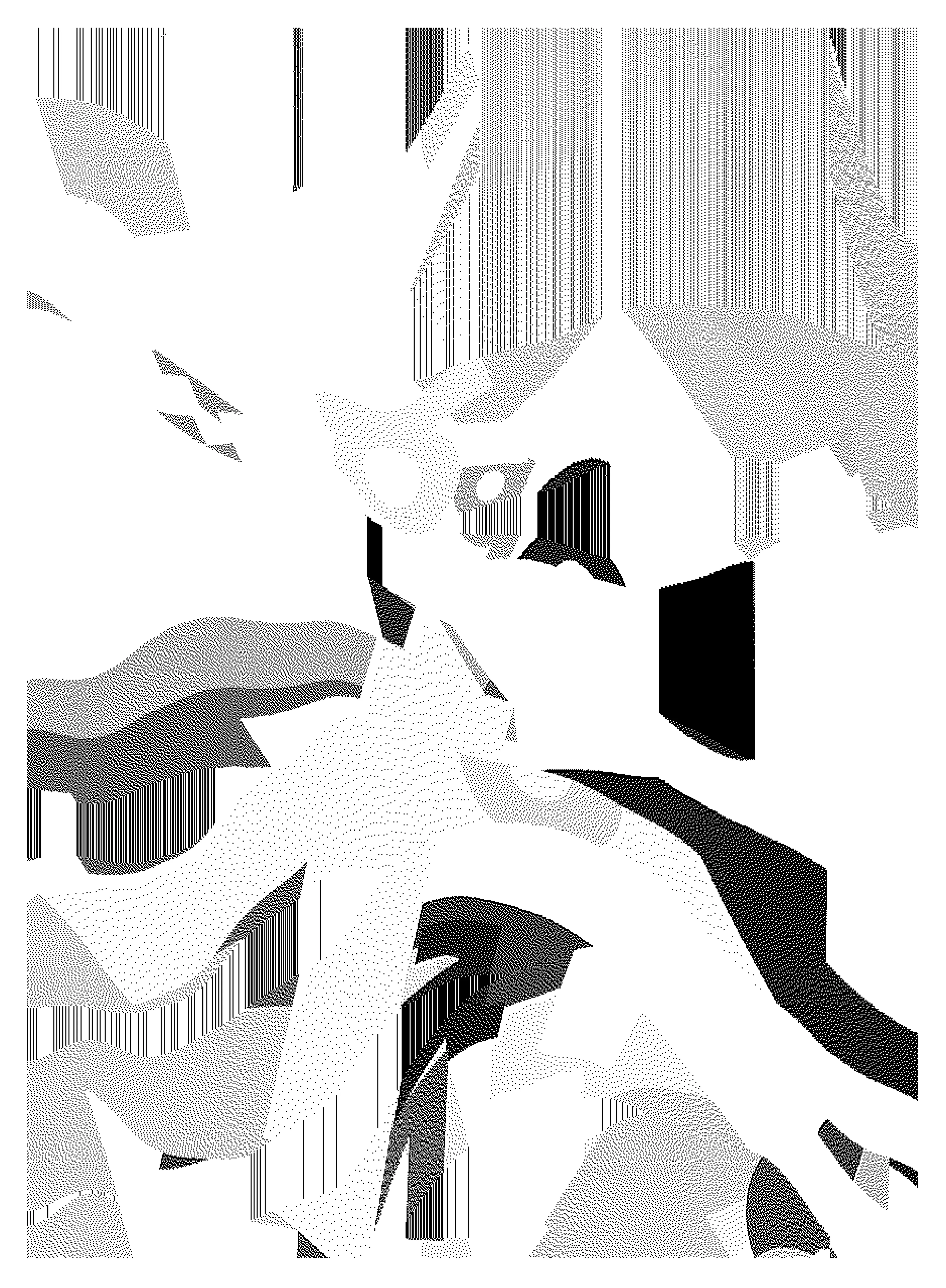
MW: Perhaps iteration #01 would work well as a happy compromise. It has areas that look like tiny hand written lines and then there is this strong overall fractured composition as if we were looking at a geographical map. There is something quite geological about it too.
IZ: Could you speak upon how “distraKted” ties and differentiates from your previous bodies of work?
MW: Well, language remains the underlying subject and text in particular. Hypertype is all about questioning the role of AI as a tool to quantify emotions from text. My Cosmic series explores the plastic and formal qualities of language. This new series is perhaps my most personal and radical visually. Some of my current research has now taken on writing and so this feels like a natural progression from pure text – the exploration of gesture and written languages.
IZ: As the series is limited in nature of artworks, could you speak about your curatorial process and what kind of things you were looking for each piece to exude within the set?
MW: It all comes back to really trying to find those visual aspects that best expressed the adjectives I mentioned earlier; fragmented, splintered, volatile, liquid, fragile …
Mark Webster
Mark Webster was born in Canada, raised in England and currently lives in France. After graduating in London with a modern languages degree in 1997, he moved to Paris and began to orientate his work towards the arts. This has involved an eclectic mix of activities in diverse areas such as animation, sound design, graphic design, teaching and even a stint as a journalist working in the field of...
Ivan Zhyzhkevych
As a long-time collector with an unparalleled passion for digital art, Ivan curates from the heart.


