verse
INTERVIEW

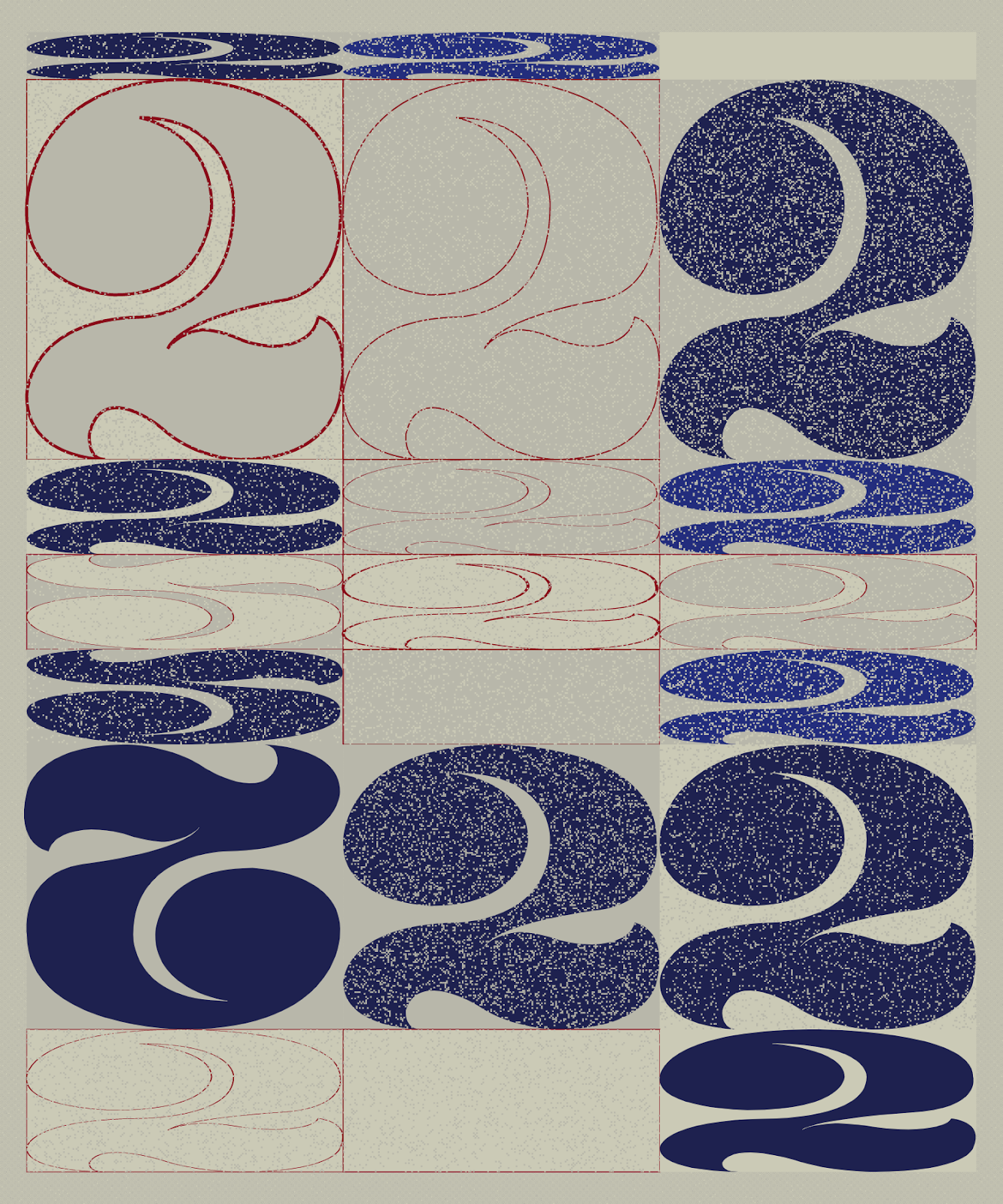
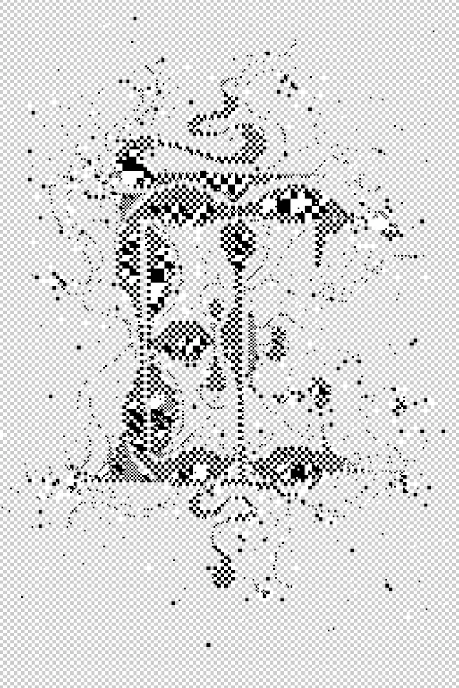
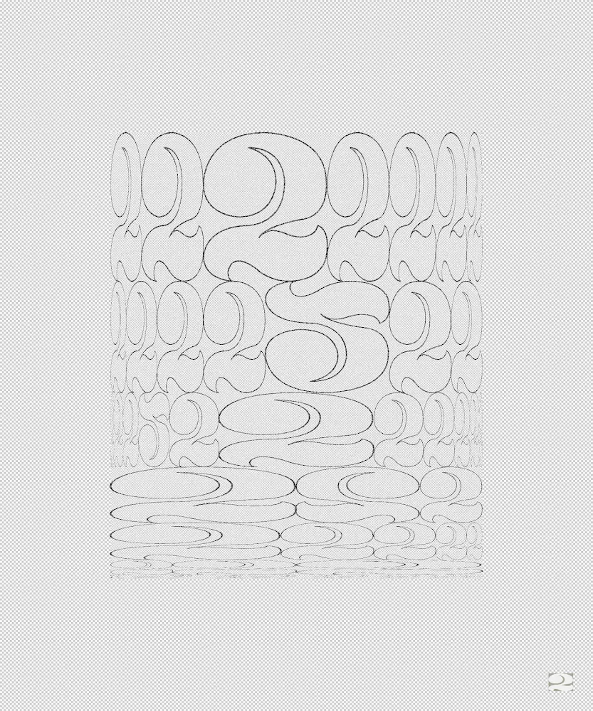
Delving into the world of symbols with Emily Edelman

Leyla Fakhr: What I love most about your work is that there is a very feminine sensibility about your compositions. Is this something that you think about when you are creating the work or is it something that just is inherent to your practice?

From Martin series by Emily Edelman, 2023

Emily Edelman: I am feminine and this does indeed organically come through in my work.

I don’t feel very gendered in my work, but I do find that my most successful work often brings together opposites. Martin uses straight, vertical lines, but each one is punctured by the broad curving line of a big circle. To me this is a feminine masculinity; a serious-playfulness and sharp softness.

Martin was the name of my grandfather, and the work is very much inspired by him. In particular by music memories my family and I shared with him. So in this way it is whole and human and familial.

In general, I want viewers to feel whatever it is their reactions allow. So you saying you feel a feminine quality in the work delights me, and I hope each viewer finds something surprising or relatable in the abstraction.

Selection of Martin outputs by Emily Edelman, 2023

Leyla Fakhr: I’d love to ask you about Martin, the series you are showing at Odysseys, how did the series come about and what were you trying to convey?

Emily Edelman: I haven’t always been a programmer but I have always been a designer of iteration, constantly trialling every possibility within a set of constraints to uncover the best way, or the most ways.

The predecessor to Martin was the first ever long form generative work I programmed myself. I took that algorithm in a new direction for this show that is about the literal journeys, or odysseys, of a generative artist’s arc. The birth of this project marked a major change in the tools I use as an artist.

Martin, my grandfather, passed around the time I started learning to code. He was a huge music lover, as is my dad. When we used to visit my grandfather, my dad stayed up all night playing guitar and I stayed up too, basking in the whole, round layers of sound. Martin is inspired by this very specific feeling of the bright warmth of shared music in a late-night family. And I hope viewers find their own version of warmth in the layers and colours.

Asemica #221 by Emily Edelman, Dima Ofman, and Andrew Badr. Owned by Zeneca. 2021


Leyla Fakhr: Your previous series Asemica, shown on Art Blocks in November 2021, observes your love for Typography. What was it that made you delve into the world of symbols ? Is this something you are keen to go further into ?

Emily Edelman: Language on paper is the coolest thing to me - it’s so ancient and still so necessary in modern society, and it has such a huge range of visual potential. Looking at text in a language I don’t understand allows me to feel the weight of this sentiment without the burden of overt meaning or legibility. Asemica was inspired by this, and so is all my work, in some way. Martin is not an overt text system, but like Asemica and most alphabets, uses a very constrained set of modules that come together using designed rules in order to communicate something.

My background in graphic design is ingrained in how I think. Sometimes it’s the grid system that drives the work, and sometimes it is specifically typographic. My collection Illuminated, which uses the same base modules as Asemica, is an example of this, as well as a soon-to-be released project that is an obsessive dive into one particular character - the number 2.


Twos test outputs by Emily Edelman, 2023


Leyla Fakhr: During our calls I get a strong feeling how much of a ‘maker' you are as well as a coder. Was it hard for you to get into coding and step away from more tactile elements? Do you see the two practices overlapping or are they separate for you ?

Emily Edelman: People talk about physical art and digital art as two separate things, but I don’t feel such a distinction.

When I think about how I want my digital work to be displayed, I think about resolution, brightness, scale, screen texture - the device it’s embedded into or projected out of. Before even thinking about printing or exhibition space, all of these things are very physical creative decisions that exist in our tactile world.

I’ve worked with metal and glass, bound books, made prints, and spent 10 years designing and producing large scale live events and activations. Each of these mediums has a physical base module, just as the physical base module of digital art is pixels. And light!

Pixel art made today is an homage to a time when low resolution and big squares were all we had. Like much of my recent work, the textures of Martin are made completely of these visible squares, or what I call “visible pixels”. They are a reminder that code is still a craft, and there isn’t much separation between hand and art.


Emily Edelman

Drawing on a background in typography and the design of physical spaces, Emily’s generative work invents new grid systems and uses simple shapes to uncover what is possible within strict formal constraints. Conversations ensue across scales and between colors, creating optical effects and emergent forms. Emily’s work explores communication, scale shift, color theory, and the “visible pixel” - a...
View profile

Subscribe to get the latest on 
artists, exhibitions and more.