Mark WebsterHypertype
Opening event
Tuesday 8th November
6 - 8pm: Reception evening
On View
8 - 13 Nov 2022
4 Cromwell Place, South Kensington
London SW7 2JE
Powered by ArtBlocks engine • Foreword by Andreas Gysin
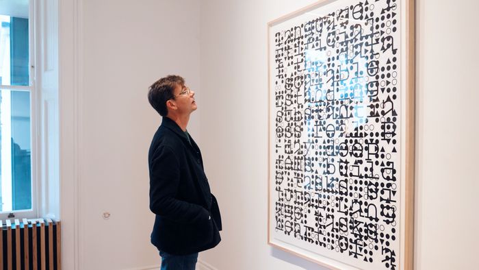
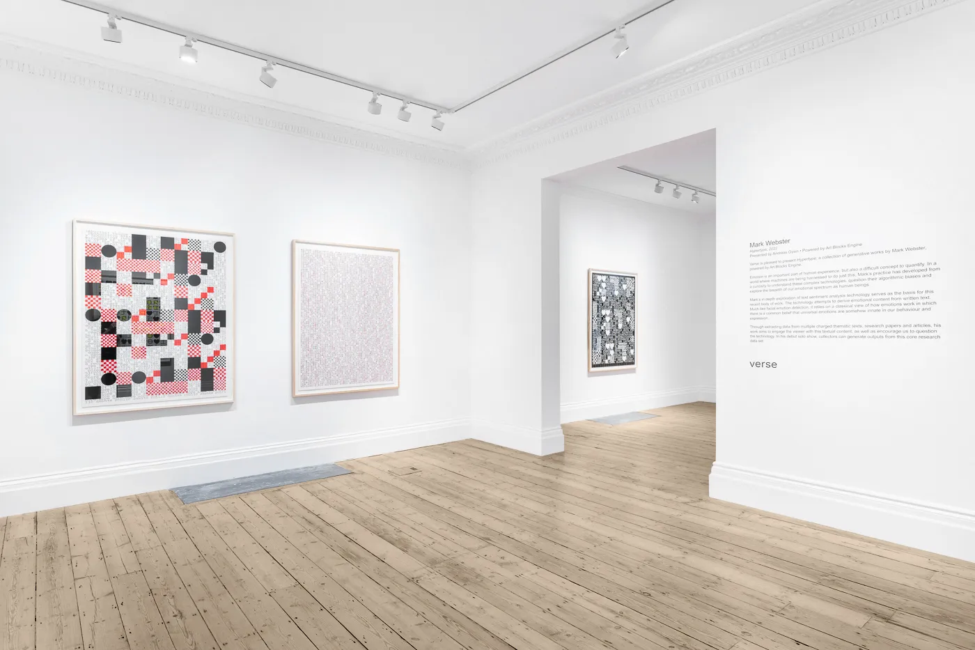
Verse is pleased to present Hypertype, a collection of generative works by Mark Webster, powered by Art Blocks Engine.
Emotion is an important part of human experience, but also a difficult concept to quantify. In a world where machines are being harnessed to do just this, Mark’s practice has developed from a curiosity to understand these complex technologies, question their algorithmic biases and explore the breadth of our emotional spectrum as human beings.
Mark’s in depth exploration of text sentiment analysis technology serves as the basis for this recent body of work. The technology attempts to derive emotional content from written text. Much like facial emotion detection, it relies on a classical view of how emotions work in which there is a common belief that universal emotions are somehow innate in our behaviour and expression.
Through extracting data from multiple charged thematic texts, research papers and articles, his work aims to engage the viewer with this textual content, as well as encourage us to question the technology. In his debut solo show, collectors can generate outputs from this core research data set.
”What I am trying to achieve is a means for transformation of one media that is manipulative of one’s attention in order to instill dogma, to another that is manipulative of one’s attention in order to encourage introspection.
In order to explore this idea, I've chosen a variety of news articles, research papers and presentations on the subjects of emotion, facial recognition and affective computing and analysed them using IBM's NLP Sentiment API. This raw data is then used as content for creating unique generative pieces that play with text and typographic form.
Hypertype is first and foremost a textual work that relies on the visual interaction of a variety of typographic signs and letters. There is visual content based on a language system and there is visual context based on a subject matter - computers automating humans.” - Mark Webster
Foreword by Andreas Gysin
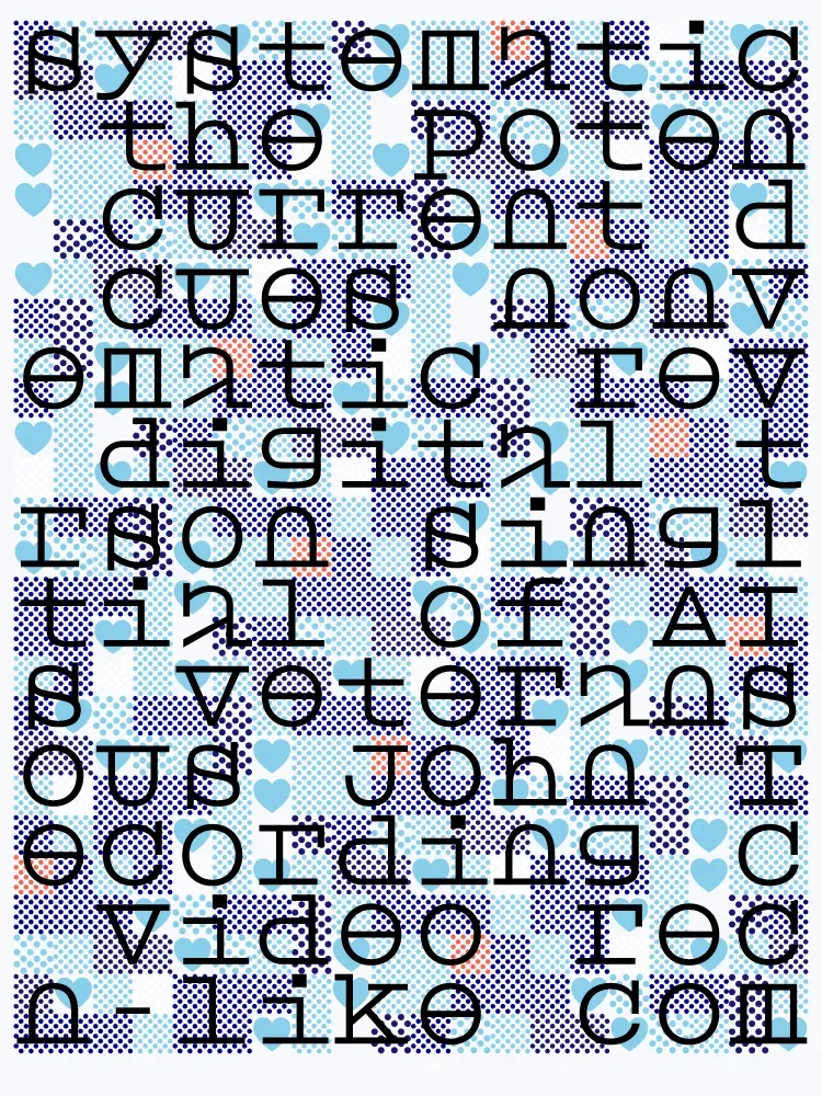
Hypertype is made up of layers of text from whole phrases to single characters and typographic symbols, creating patterns through repetition and spatial displacement. Two main layers offset with varying glyph sizes creating visually interesting overlaps. While one of the layers remains either black or white, the other features a small palette of colours.
The font used for Hypertype has been designed specifically for the project and looks strangely futuristic with familiar letters becoming quite abstract in form. Some letters are completely closed like the ‘u’, ‘e’ and ‘v’ while others have common parts missing - the most remarkable example being the open bowl of the lowercase ‘a’. Such ambiguity in the letter construction may well reveal part of the project’s intention. Clarity, readability and even understanding may well not be a priority of the project but due to how our brains are wired and the fact that English words can still be deciphered, we grasp at meaning from these abstract forms.
The context of an underlying program that is trained to analyse and classify sentiment and emotion is mirrored back to us in a sort of convoluted feedback loop, from man to machine and back.
As I’m looking through some of the infinite variations generated from Hypertype, one in particular strikes me. It features a heart, a plus sign and some letters. It reminds me of a declaration of love like the one one may see etched into a tree or a stone. Two initials brought together under one sign, anonymous to most passersby but charged with meaning and sentiment for those these little symbols represent.
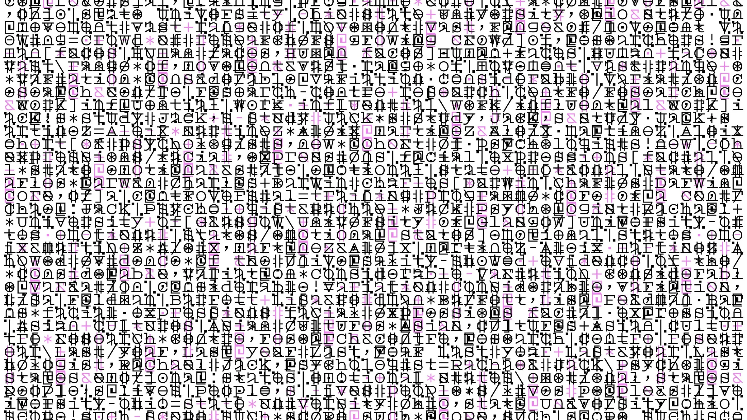
Mark Webster, Hypertype, 2022. Sample output. Image courtesy of the artist.
”What I am trying to achieve is a means for transformation of one media that is manipulative of one’s attention in order to instill dogma, to another that is manipulative of one’s attention in order to encourage introspection.
In order to explore this idea, I've chosen a variety of news articles, research papers and presentations on the subjects of emotion, facial recognition and affective computing and analysed them using IBM's NLP Sentiment API. This raw data is then used as content for creating unique generative pieces that play with text and typographic form.
Hypertype is first and foremost a textual work that relies on the visual interaction of a variety of typographic signs and letters. There is visual content based on a language system and there is visual context based on a subject matter - computers automating humans.” - Mark Webster
Foreword by Andreas Gysin
Hypertype is made up of layers of text from whole phrases to single characters and typographic symbols, creating patterns through repetition and spatial displacement. Two main layers offset with varying glyph sizes creating visually interesting overlaps. While one of the layers remains either black or white, the other features a small palette of colours.
The font used for Hypertype has been designed specifically for the project and looks strangely futuristic with familiar letters becoming quite abstract in form. Some letters are completely closed like the ‘u’, ‘e’ and ‘v’ while others have common parts missing - the most remarkable example being the open bowl of the lowercase ‘a’. Such ambiguity in the letter construction may well reveal part of the project’s intention. Clarity, readability and even understanding may well not be a priority of the project but due to how our brains are wired and the fact that English words can still be deciphered, we grasp at meaning from these abstract forms.
The context of an underlying program that is trained to analyse and classify sentiment and emotion is mirrored back to us in a sort of convoluted feedback loop, from man to machine and back.
As I’m looking through some of the infinite variations generated from Hypertype, one in particular strikes me. It features a heart, a plus sign and some letters. It reminds me of a declaration of love like the one one may see etched into a tree or a stone. Two initials brought together under one sign, anonymous to most passersby but charged with meaning and sentiment for those these little symbols represent.